The Foodie Patootie Got a Facelift!
Well, well, well, what do we have here.
I haven’t blogged for two weeks, but I have good reason. I didn’t want another post to go out until I had a lovely NEW BLOG DESIGN to accompany it. So here I am, filling you in on what’s new around these parts.
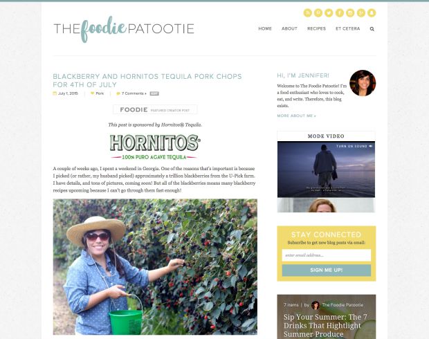
You all know how incredibly talented I think Lindsay behind one of my favorite blogs of all time, Love & Olive Oil, is. And that I’ve been a reader for quite a while. An owner of their cookbooks. And now, a fan of Purr Design, Lindsay’s website design company. Okay, well being a fan of Purr is nothing new seeing as how I’ve been ogling over their other blog designs out there for over a year.
OVER A YEAR. Since I’ll always remain honest on this site, I’ll tell you that I was waiting until my blog made steady income so that I wouldn’t have to use any money from my regular, 40-hour week job for the design. I got to that point and then some so I reinvested and I couldn’t be happier.
Some of the noteworthy overall design features:
- A textured background: I went back and forth on whether I wanted all white or something with a little bit more design, and ultimately this is what we went with. Love that the content is highlighted a little more.
- Blue and yellow: Two of my favorite colors, woven seamlessly together into the design.
- Brush font in the logo.
- Stylized elements: I’m talking the icons for the date, category, and number of comments.
Here’s what else is new!
Recipe Index
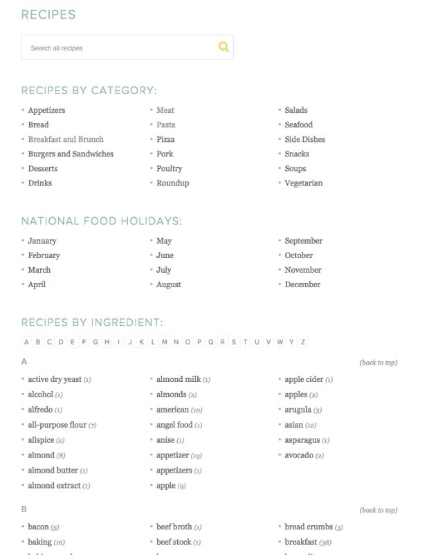
Perhaps the thing I’m most excited about is the recipe index. I previously had the Foodie Pro theme on my site, which is a great template, but I wasn’t as happy with the Recipe Index. Lindsay breaks down my recipes by category, national food holidays (because that is a huge part of this blog), and ingredient! Now, I just have to go through my recipes and reformat them to make the ingredient search more accurate.
Have some carrots in your fridge you don’t know what to do with? I’m your gal!
Mobile Responsive
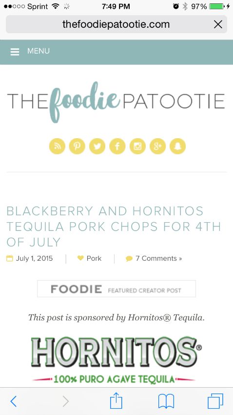
Originally, due to the increase in project total, I decided not to go for the responsive design. Clearly I wasn’t thinking straight. Almost immediately after I said no to responsive and decided I was totes okay with you all pinching and zooming, Google released the news that non-responsive designs would be penalized in the search rankings.
It was a sign. Add ‘responsive’ to the design, please! And I love the way it looks just as much as the desktop version.
Now, when you search for a recipe I have on my site, hopefully I appear right where I should, instead of in the depths of search engine hell…aka the 11th page of Google.
Footer

My footer not only has a subscribe box, but will also show the most popular recipes on my site. Sign up for my emails so you can see the lovely design of that too. It matches the site, obvs.
Teaser-Style Posts
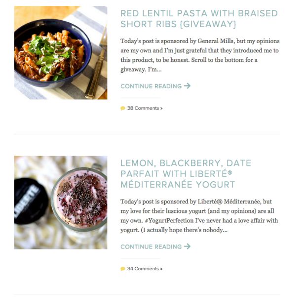
After the most recent post, which shows more on the homepage until I insert a “read more” link, the older posts are most concise on the page. Now, you won’t have to scroll scroll scroll scroll scroll ad infinitum through fully drawn out posts. You’ll be able to see more recipes in one scroll of your mouse so it’s quicker to get to the recipes you’re interested in.
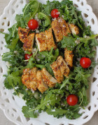
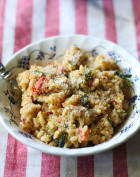
And you’re totally interested in pasta and parfaits, right?
Purr Design is awesome!
I have to say how great it was to work with Lindsay! I love everything about my new design, and she was super patient as I made my way through the site and asked for changes. Also, she took just a couple of tidbits of information and preferences I gave her and it didn’t take many mocks for it all to come together. Such a pleasure to go through this entire thing and finally, finally have a site I love everything about.
Because of the new design, I’m feeling more motivated than ever before! Upcoming projects include:
- Email opt-in (you’ll want this one, promise!)
- New social media designs
- More and more blog posts!
😍😍😍😍😍😍😍😍😍😍😍😍😍😍😍😍😍😍😍😍😍😍😍😍😍😍





I love the new look! Love, love, lovvvvve!
Thank you! I looooooooove it.
Congrats on the new, beautiful design! I love PURR. It’s on my wish list to get my site designed by them!
Thank you, Lauren!! I definitely recommend them.
Oh my goodness! Your new design looks incredible! So excited for you and for all the fun, new things you’ll be doing now that the new site is live.
Aw, thanks, Erin! The new design was exactly what I needed to feel motivated about my blog again.
Didnt see it before as this is my first time on your site but the layout is gorgeous!
Miche from Buttons and Birdcages
Well, trust me, it’s much better – haha!
The new design is lovely and so inviting. The recipe index is a great upgrade.
Thanks, Bri! Purr did a really great job.
I like the look of everything. I agree a textured background gives it a little something special. The recipe index is my favorite new feature I think!
Thanks, Ashley! The recipe index is my favorite feature too. 🙂
Your make over looks great – very clean and professional, yet inviting. I love the textured background and your colors. .
Thank you, Joanne! Having a clean, designed layout is exactly what I need to stay motivated.
I’m viewing your site from my phone right now and LOVE the mobile design! I’ve been looking to redesign my blog so I will definitely look into pure designs!
Oh good! It’s so important to have a mobile-responsive design. I would recommend Purr a million times over.
I love everything from the color of the images to the receipt list. everything is so well organized and structure in a way that is easy for the reader to follow. Thank you so much for sharing.
Thank you, Sacha! I can’t recommend Purr Design enough.
I love the new look! It looks really clean and put-together and great for keeping the focus on the your content.
Yay, glad you like it!
What a great look, so clean. I especially love the ingredient index, I just have a recipe one.
Thanks, Maria! I like the ingredient list so much.
I’ve told you a billion times, but I just can’t stop saying it, I love, love, love your new site!! Like soooo much. I didn’t even know about the recipe index. That is so awesome! Thanks for sharing this post! I look forward to all the upcoming projects! 🙂
Woot! My most dedicated fannnnnn right here!